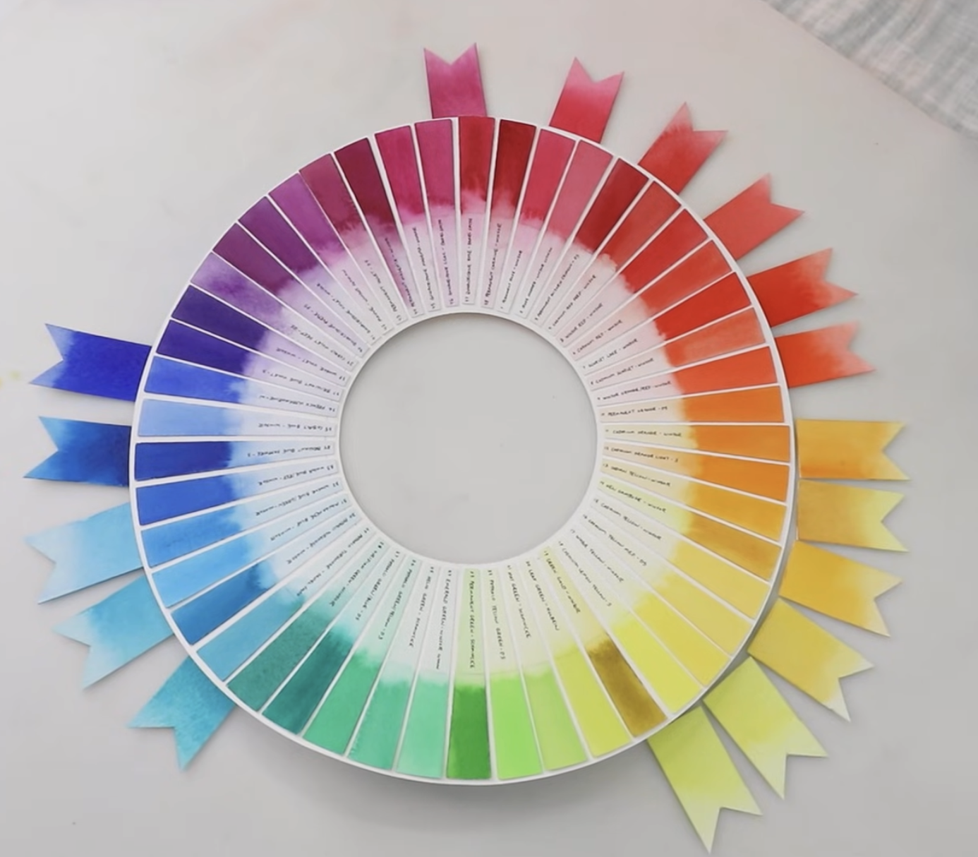
Pure Colors Don’t Exist: Undertones.
I’ve always had this idea about fully saturated primary colors, Red, Yellow, Blue, that they are completely neutral. Meaning, these colors are completely uninfluenced by the shades of colors next to it, a Red is just a Red. However, even a Red that appears “Red”, can still have a very small drop of yellow in it. This is called an undertone, as illustrated by the color wheel below. There are reds which sit in the middle of the family, however, they will always still be cold leaning (purple) or warm leading (orange) even if it is so subtle you cannot even see it.
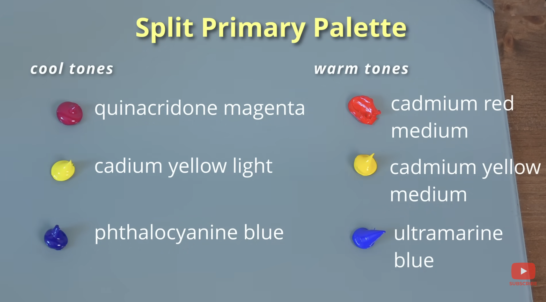
The Idea of undertones becomes especially important when mixing colors. This is where the Split primary palette comes into play. It gives you a full range of primaries, both warm and cool leaning. When mixing, think where colors are leaning. Refrenceing the color wheel above a blue leaning red mixed with a red leaning blue, They WANT to go towards each other. It’s within the nature of their undertones. However, when you mix a green leaning blue and a blue leaning red, you will result in a muddy color. This is because the warm undertones are not leaning towards eachother. So, if the palette is split, you will mix the warm blue with the cool red. Warm, leaning reds and yellows will create the most vibrant warm oranges. So mix warm and warm. cold leaning yellows and blues will make the most vibrant greens. However, Because the color wheel flips from warm to cool, you need a cool red and a cool blue to make the most vibrant purple. Note yellows value isnt that strong so it will still make a green and orange however it is only slightly muddied.
Finally, this even applies to black and white when mixing. If you notice your “pure white” say a titanium white, start cooling your mixes, this is why. This is often why painters use ultramarine blue and burnt sienna to mix neutrals, because you can shift if it’s warm or cool.
So before mixing, always ask yourself if this color is warm or cool leaning. Side note: This is just in isolation to mixing and the color wheel. When I refer to colors as warm and cool they can all change in context while in the overall picture.
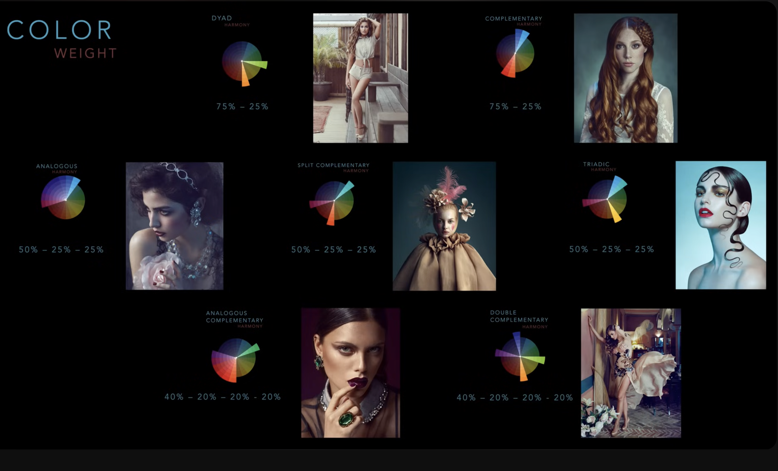
This has become a huge leap in my understanding of color through self-teaching, and I thought I’d share and document it. Also, below is a snippet on color weight and color harmonies. Which I thought was useful, and I might write about in the future. Aswell as a sainer color study/